 Visit
VisitBrand New
2026It’s All Fund and Gains
Nailed this one beautifully.
Partnering with our brand team and Koto, my role was to help shape a new identity that fit into our design system without compromising on accessibility.
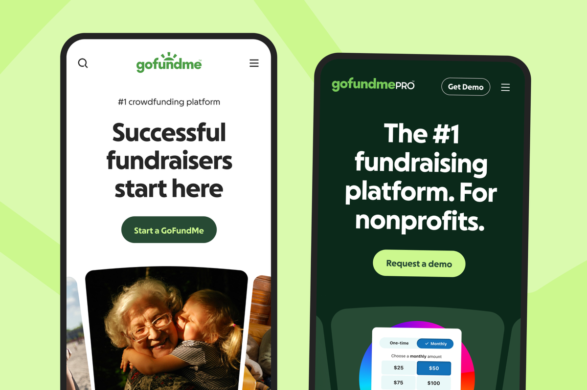
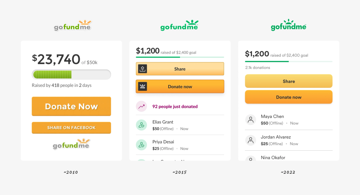
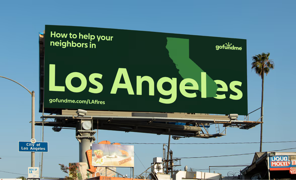
Before the rebrand, designers had done a lot to modernize the experience, but the brand lacked range. Our color palette was narrow and dated. We had no graphic system to create moments of emotion or emphasis. Buttons fought for attention. Our typeface was too wide for mobile. We all felt the same itch to do more.
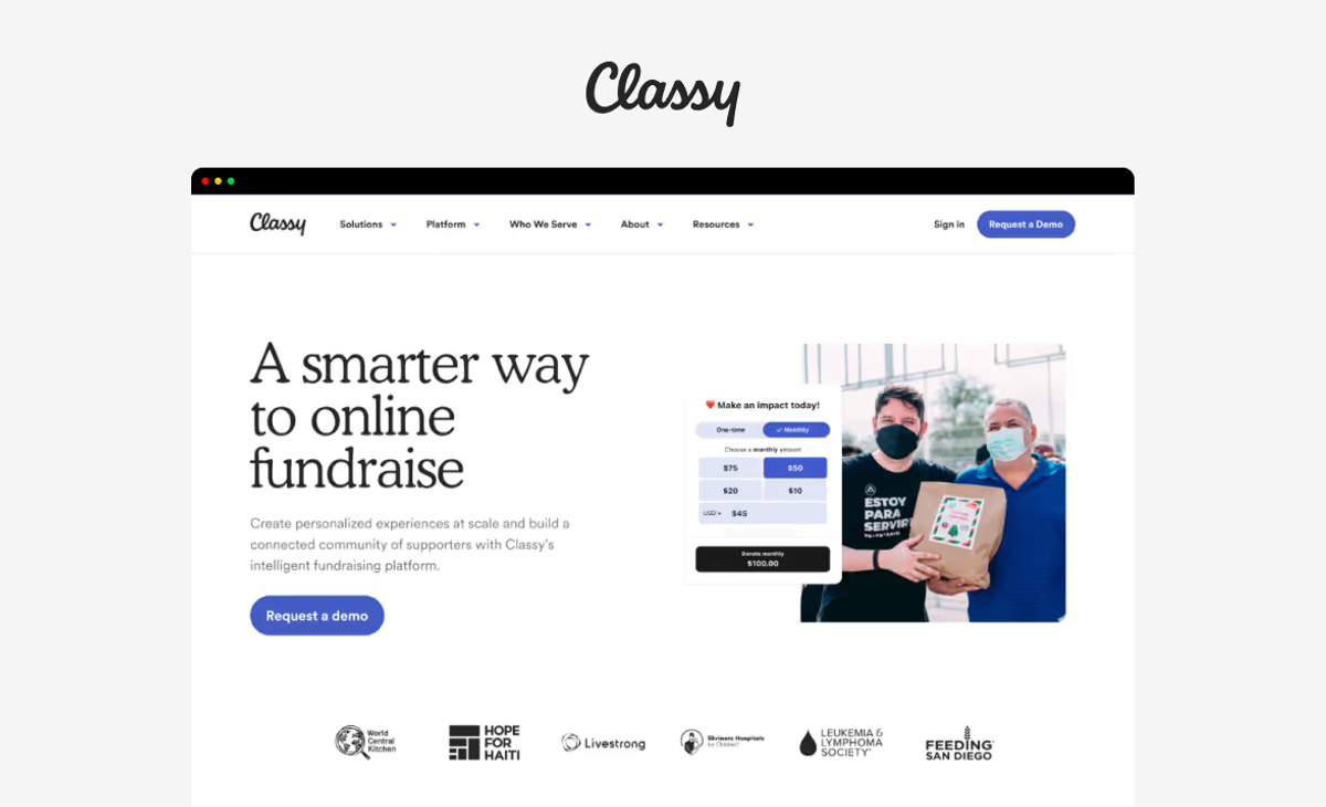
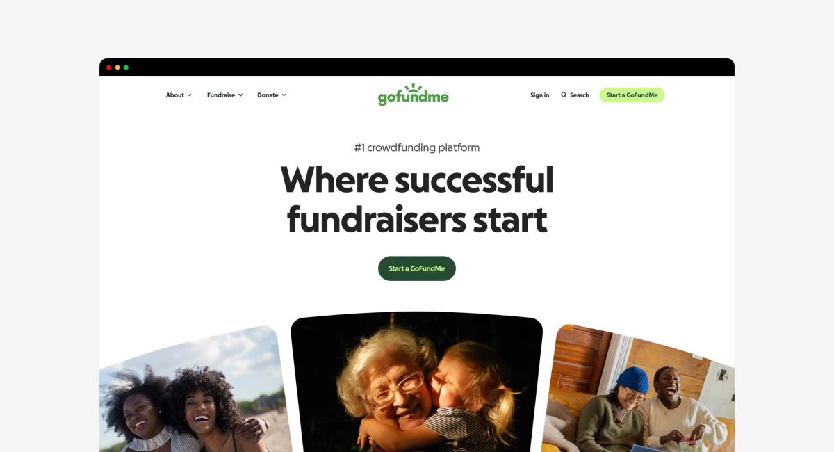
Then GoFundMe acquired Classy, a leading platform for large nonprofits. The teams had merged, but the brands hadn’t. We saw the opportunity to unite them. Classy would become GoFundMe Pro. The question was how to make the two feel like one. That question sparked the rebrand.
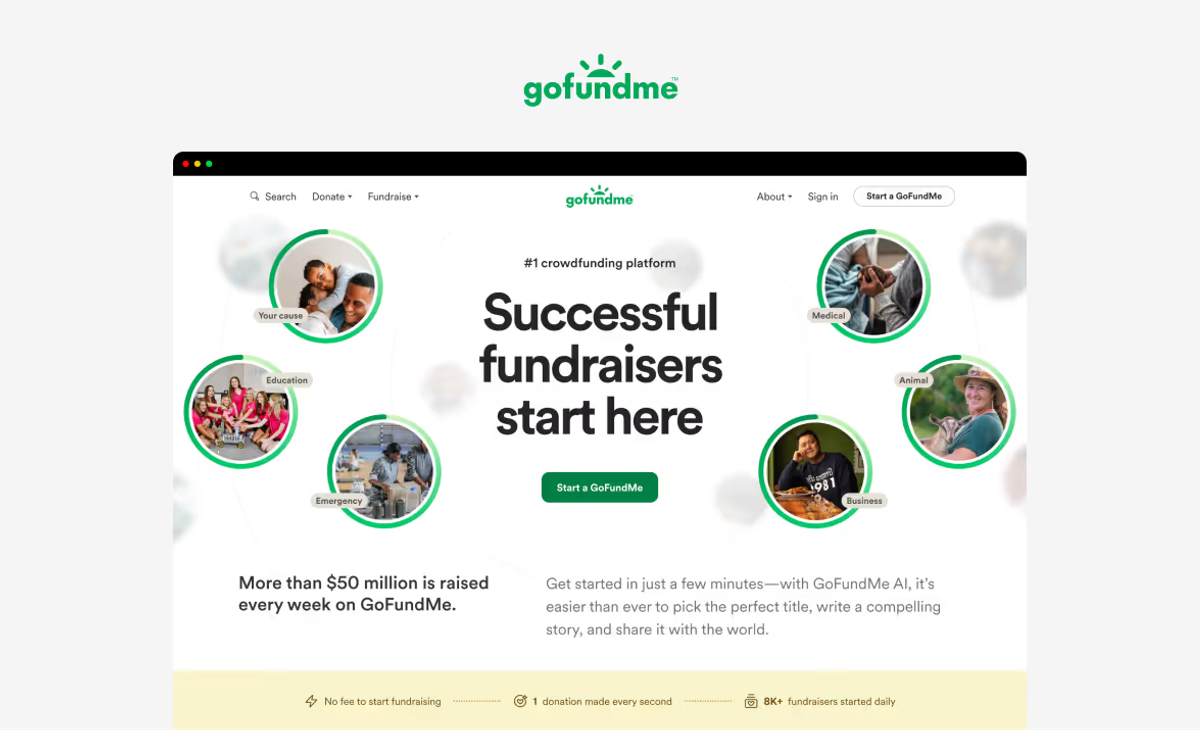
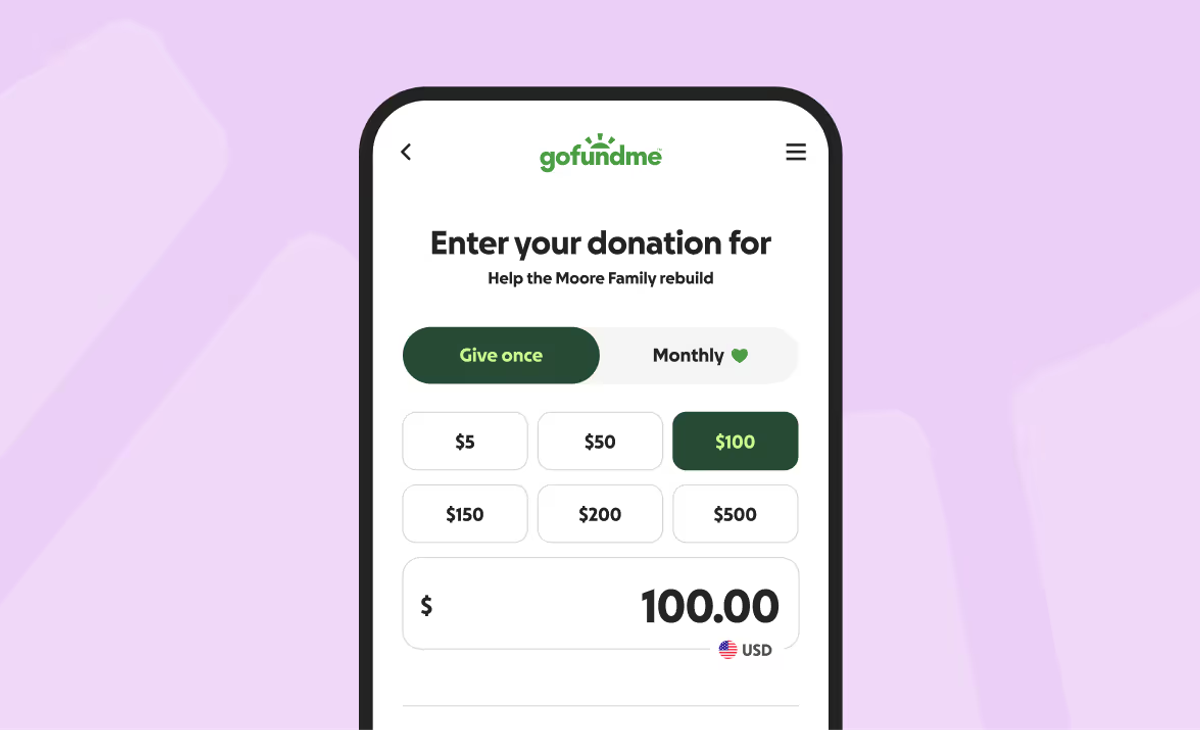
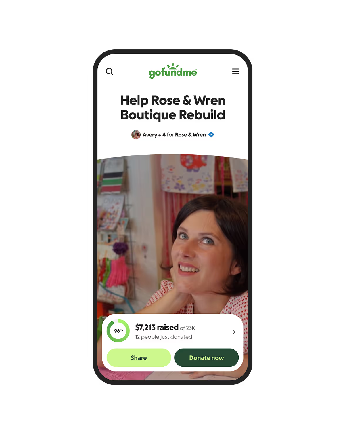
The challenge was clear: stay true to our green without dulling it. Using Leonardo, I experimented with accessible color ramps and uncovered something important. In most green ramps, the middle shades often define the brand—but they rarely meet accessibility requirements. By pairing lighter greens with darker ones, we maintained the recognizable sense of green while introducing the contrast and vibrancy we’d been missing. This led us to explore duotone colors, which became the foundation for our palette and emphasis system.
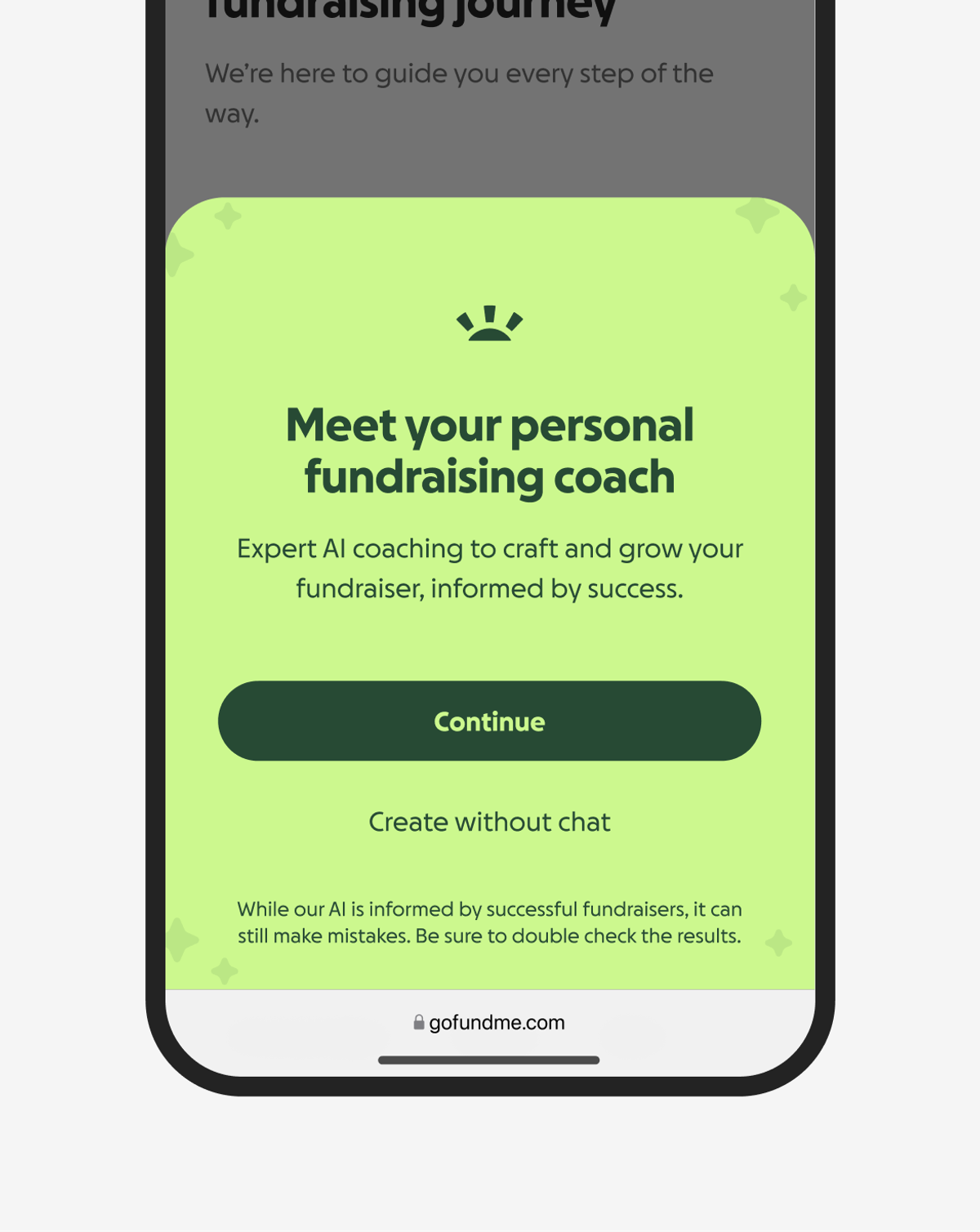
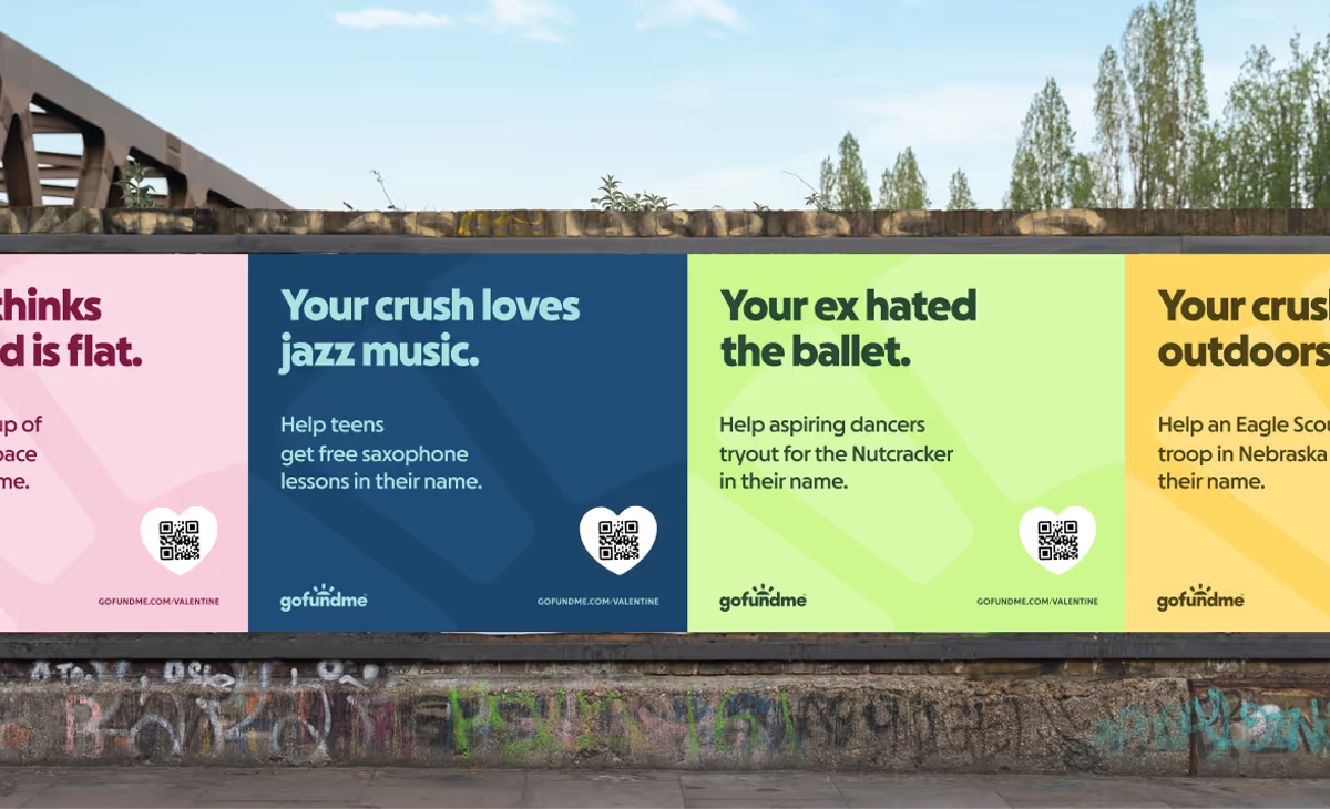
In the last decade, the appeal of minimalism has begun to fade. Culturally, we are craving more contrast. Absurdism is back in advertising, brands are bolder, and homes are filled with color and character again.
Recognizing the changing color cycle, when the GoFundMe rebrand began, one of my goals was to move us away from pastels. We needed something more vibrant, something dignifying but also encouraging. As we explored color, we leaned on our design team for feedback. Even our CEO chimed in, noting that one green felt “too electric” (he was right). We landed on an empathetic and optimistic palette.

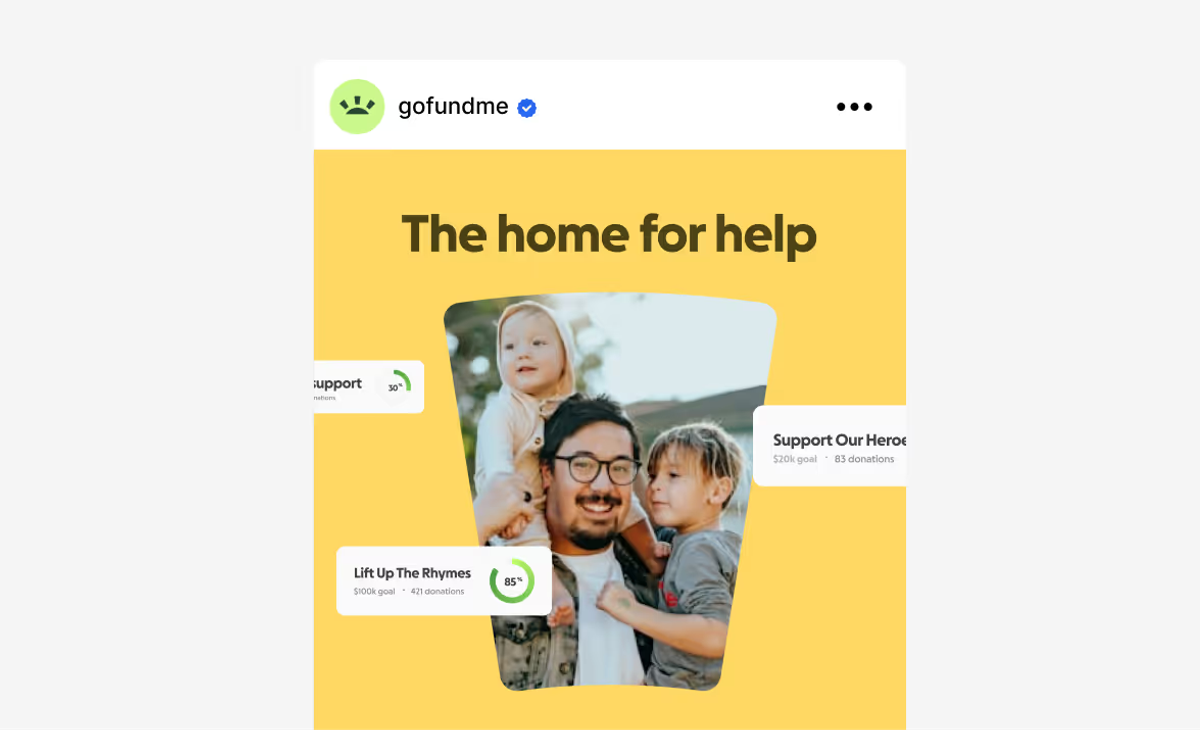
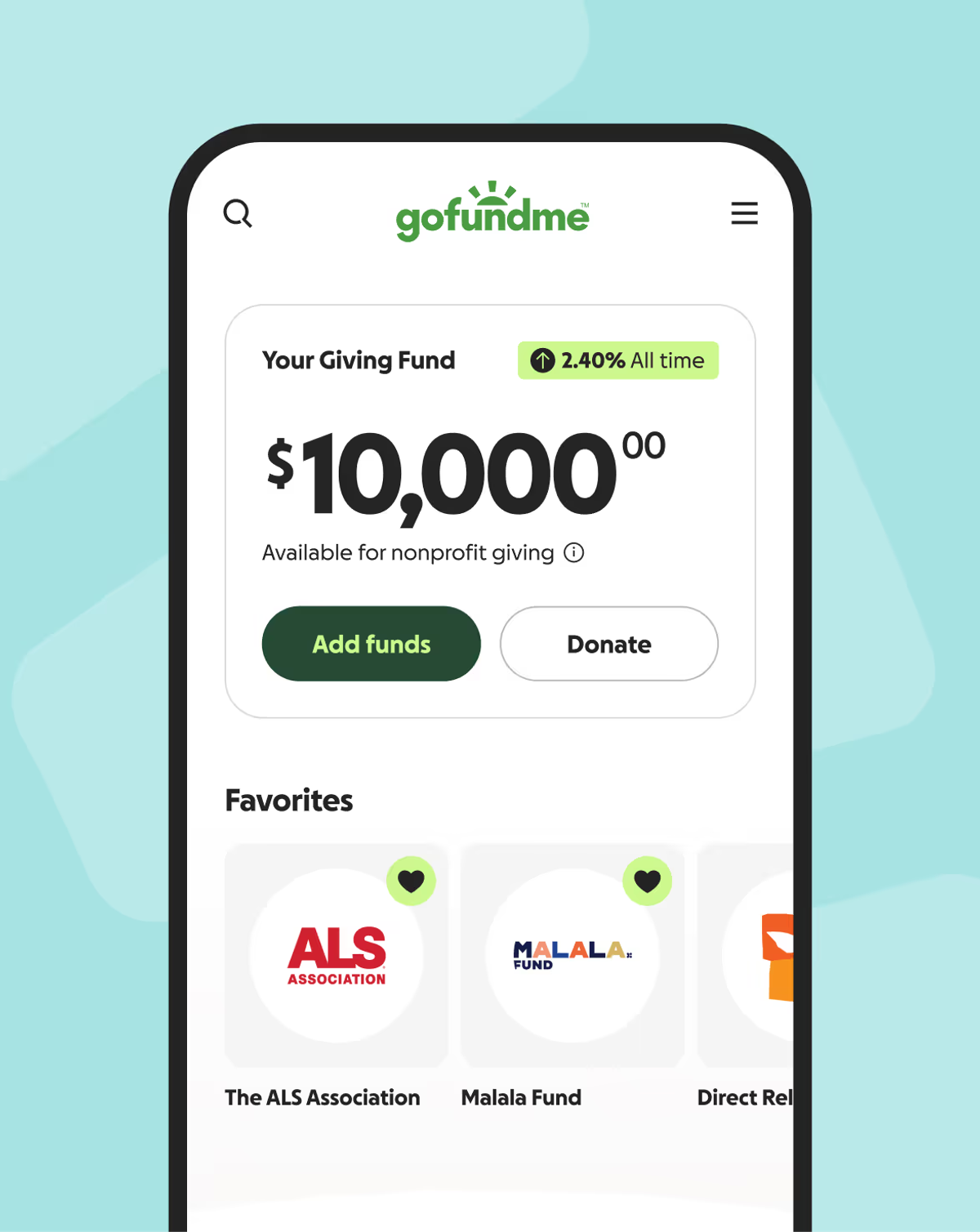
Pro’s users are different, teams at large nonprofits focused on impact at scale rather than individual stories.
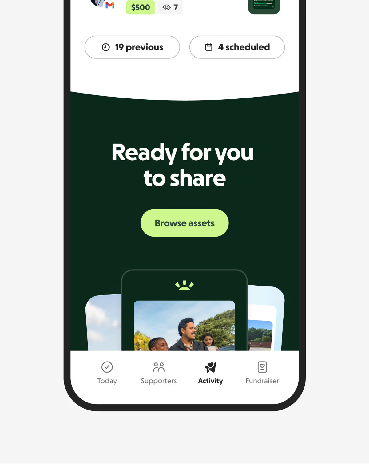
For the Pro marketing experience, we chose a dark palette inspired by the idea of “Pro” itself, similar to Apple’s Pro product line, but not black. Black felt too cold. Instead, we used the deepest green in our palette to anchor the design, giving Pro a premium look without losing its connection to GoFundMe.
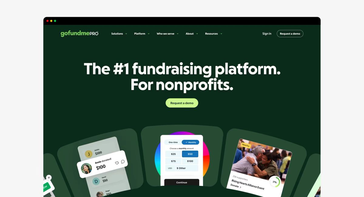
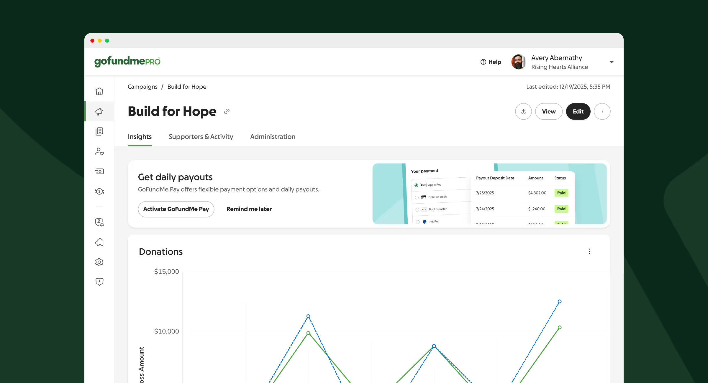
Inside the product, we stripped away distractions. Less vibrant colors. Just clarity and focus, expressed through premium black buttons and an enterprise layout. Both systems, GoFundMe and GoFundMe Pro, now share the same core palette and graphic language, each adapted to the world it serves.
Koto, had strong ideas about type, but when they pitched a typeface called Melun, I’ll admit, I didn't love it at first.
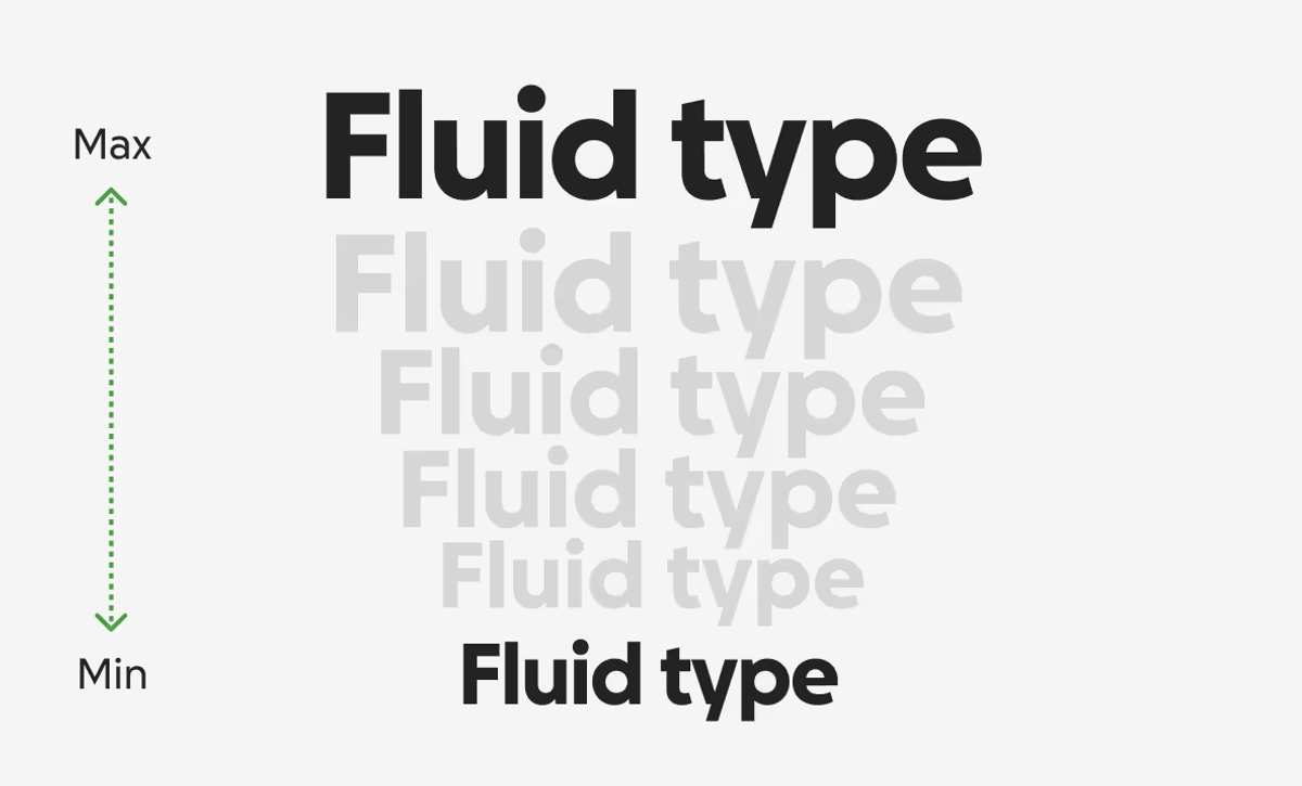
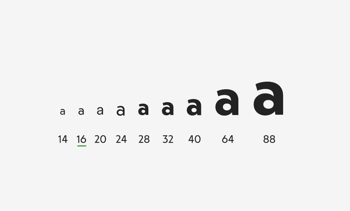
Melun had charm, but I knew it needed more refinement for our brand. Its scale was off by a few pixels from our previous typeface, Circular. That might sound small, but those pixels held together our typographic system built on musical proportions and fluid type. Some characters felt too stylized and hard to read. Still, Koto saw potential.
With my long list of requirements, we partnered with the foundry to reshape it into something new: GoFundMe Sans, refined, balanced, and unmistakably ours.
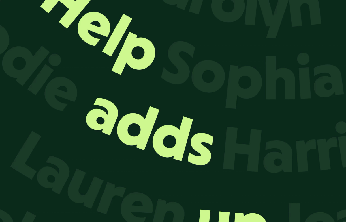
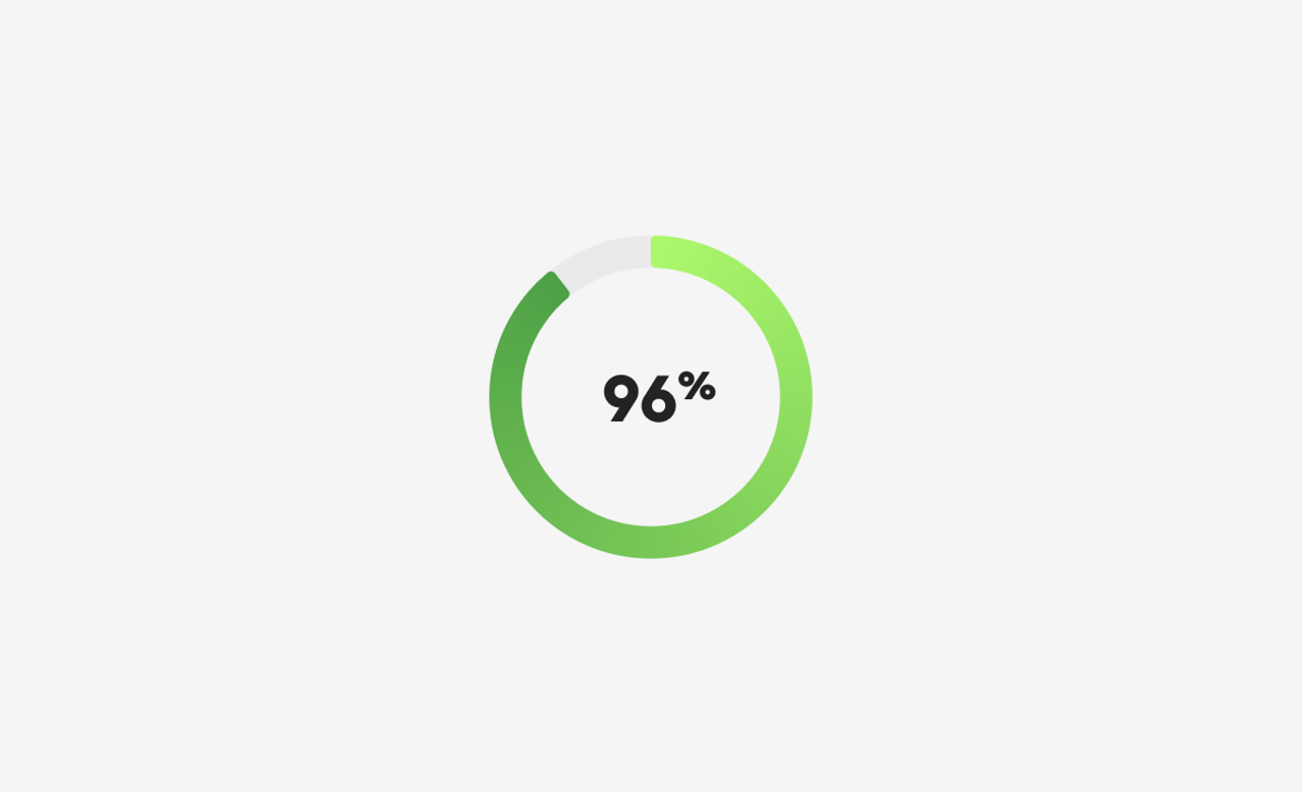
The rebrand was featured by leading design publications including Brand New, Print Magazine, and Creative Boom, which highlighted its evolution of GoFundMe's iconic progress bar into a scalable brand system. Reviewers praised the identity for balancing familiarity with modernization and for grounding the visual language in the platform's core idea of progress and collective generosity. Following the launch, GoFundMe's brand continued to receive industry recognition, including honors from the Shorty Awards.
Being part of the core team that reimagined GoFundMe was deeply rewarding; I stretched every part of my craft while keeping the people we serve at the center of every choice.